Opinion Piece - Mark Bithrey (B3 Director)
Something I hope to do more of in 2020 is write. When we asked for topic suggestions from the team, the first one that came up was 'Colour of the Year' I groaned, and then we all laughed. As designers, we do find the concept bewildering. How could you possibly have one colour of the year? What is this colour for?
To prove that it doesn't mean much to designers, we conducted a quick experiment in the B3 Studio - everyone sent us what they thought was the colour of 2019 and what they think would be the colour of 2020 (before Pantone released it). Results at the end of the article!
The Concept
It was in 2000 that Pantone began announcing a Colour of the Year. 20 years in, this year's colour is Classic Blue. I do like blue, I'm a blue person, I wear blue all the time. I'm going to have plenty of retail choice this year.
But as designers, I think we would never design something using blue simply because of its newfound title. Our objective when working on interiors and branding for our clients is to let the brand speak through a diligent process of design thinking, to reveal to us what its "true colours" are.


Does the colour of the year influence anything?
Until I began thinking about this article, I had never actively looked at the Colour of the Year. Without a doubt, there have been times when a particular colour has been popular. You end up finding yourself using it plenty in the flurry of it all, and a few years later you wouldn't go near it. Lime green is a great example - at its zenith it was fresh, acidic, zingy. I remember experimenting with it for some internal branding at B3 Designers. You wouldn't catch me looking at it now (check back again in a few years though).
Is it fashion that drives colour trends? It tends to start on the catwalk, drifting into the more affordable and accessible mediums. Fashion is quick to latch on to trends influencing us all and bringing them to our daily lives. It inevitably starts to affect how we design spaces. But fashion also looks to architecture and interiors which change comparatively slowly - so it’s a cycle of inspiration.
I may have changed my mind.
In the process of this exercise, we found that perhaps the Colour of the Year has indeed been influencing us to some extent. There’s something quite fun about having a focus colour.
Putting one hue on a pedestal makes you pay attention to things around you, looking for matchings and pairings.
I certainly am looking at the world differently now that Classic Blue has been brought to the forefront of my mind. If we end up using it in our 2020 projects, that’s a post for next year!
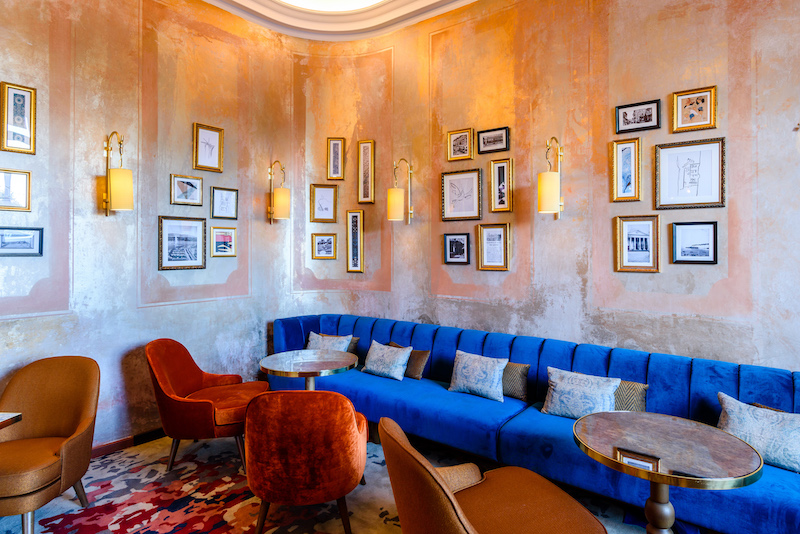
In the meantime, here are some projects we’ve done in the past where blue has dominated. This is a tricky one with F&B interiors as blue isn’t always a popular choice owing to its coolness. So our goal always has been to add warmth with complementing colours.