
BRAND IDENTITY DESIGN
B3 Designers worked on the branding and identity design, along with the interior design for MARU - a high-end Omakase restaurant in Mayfair, London. In keeping with Japanese aesthetics, we went with a minimalist design across interiors and branding, choosing materials and graphics to create rhythm.
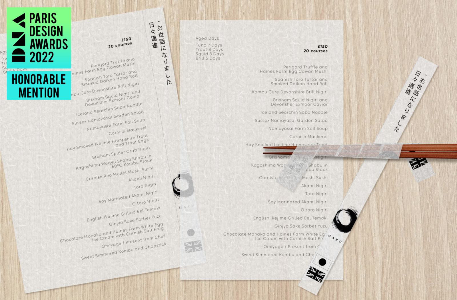
Our approach to the branding and identity design took inspiration from the Head Chef Tayaji’s family name - Maruyama. Maru means ‘painted circle’ in Japanese, and that became the key symbol for the entire visual identity. B3 Designers worked on: The logo, print, typography, menus and chopsticks, stamps, furoshiki, branded bags, and uniforms.

LOGO AND COLOUR SCHEME
The logo is a bold brush-stroked circle, and the personal signature is a Kanji stamp in black and red. We went with a bold serif font to complement the circle.
The colour scheme was defined with a strong red, olive green, black, and beiges.
OTHER COLLATERAL
Our brand recommendations included dark wood with a burned-effect logo stamped for signages, Furoshiki-wrapped chopsticks for guests, washi paper made with excess paper from the menus to wrap around the chopsticks, brand-printed scarf and pocket square, and wooden takeaway boxes.


